Strategy Analyzer
The Strategy Analyzer is AlgoChef's core analysis tool. It takes one strategy's trade history and generates a comprehensive Quality Report — 200+ metrics, the five scores, and detailed visualizations, organized as one scrolling page with a section navigator in the sidebar.
Where to find it: Open a strategy from the Strategy Hub — double-click its row or choose View SA from the row menu. The report is titled {Strategy Name} Report with the symbol and trade direction underneath.
Quality & Overview
Strategy Quality
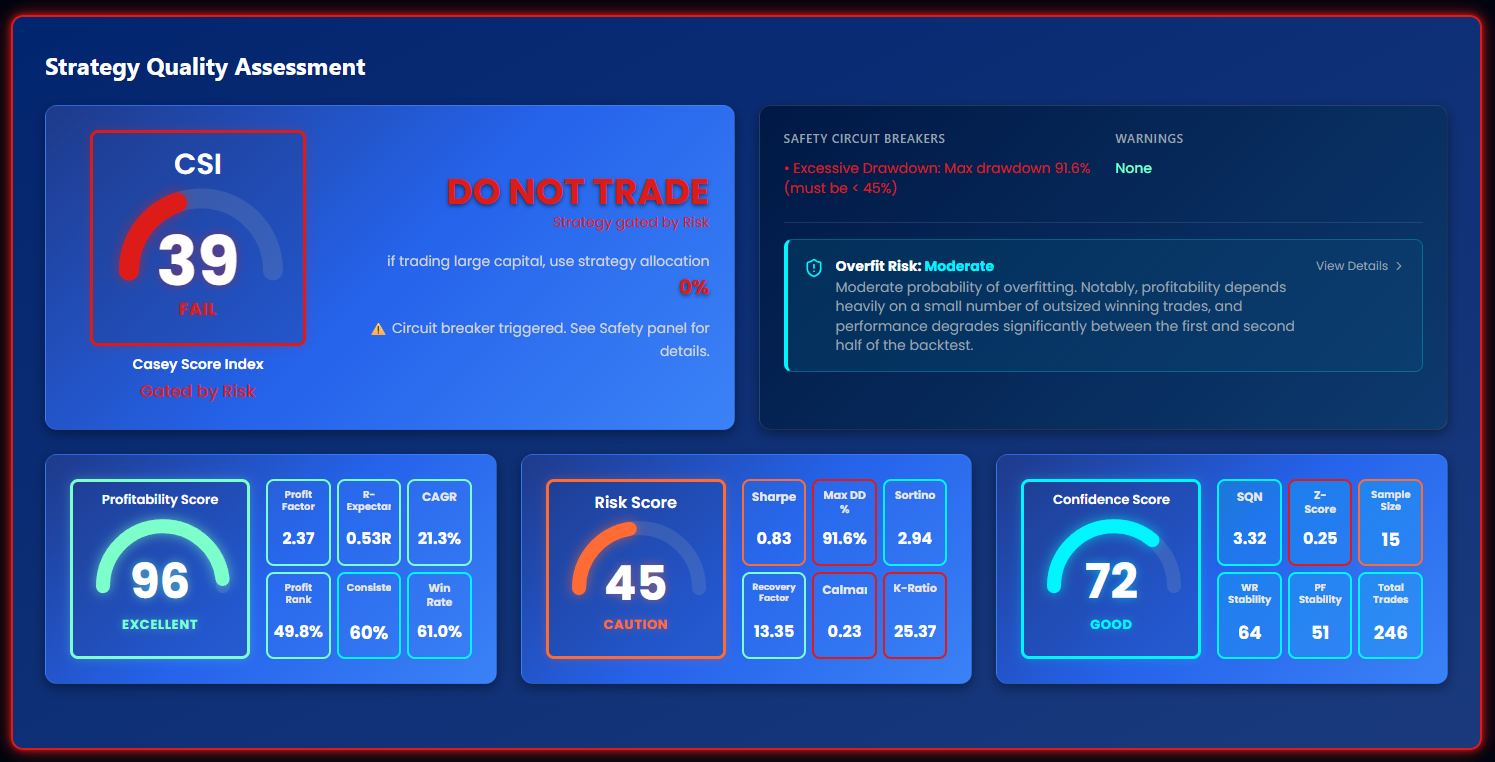
The top section shows the five-score summary — CSI, Profitability, Risk, Confidence, and Health — with tier badges and plain-language interpretation. Any circuit breakers or gates that capped the score are flagged here, so you always know why a score is what it is.
Equity Curve
Interactive chart of account balance over time, with drawdown shading. Toggle between dollar and percentage views, switch the x-axis between calendar dates and trade numbers, and use log scale when the equity range is wide.
Top Drawdowns
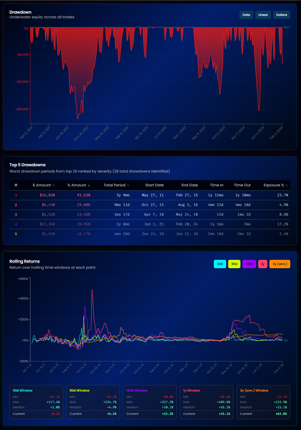
Ranks your strategy's worst drawdown periods — the 5 most severe from a pool of up to 20. Each shows the dollar loss, percentage severity, duration, time to recover, and what share of the backtest it covered.
This answers: "What are the worst losses I should expect, and how long will recovery take?"
Rolling Returns
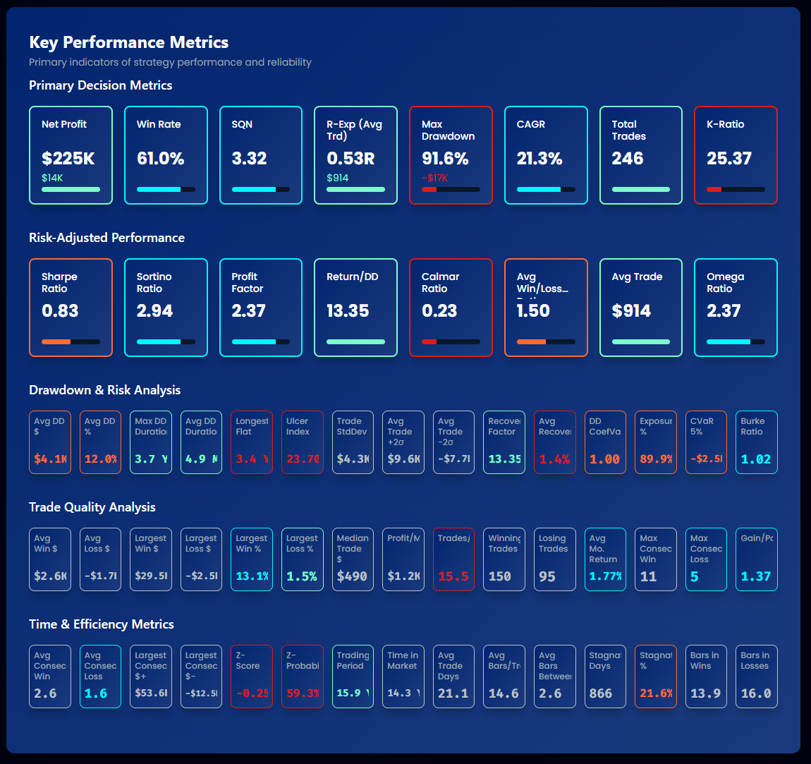
Trailing returns across five windows: 30 days, 90 days, 1 year, 3 years (annualized), and 5 years (annualized). For each window you see the minimum, maximum, median, and current rolling return.
This answers: "Is my strategy consistently profitable across different lookback periods, or do returns cluster in one lucky stretch?" A strategy whose current rolling return sits far below its median may be degrading — cross-check with the Health Monitor.
Key Metrics
A grid of the most important numbers: Net Profit, CAGR, Max Drawdown, Sharpe Ratio, Profit Factor, Win Rate, R-Expectancy, and more. Every metric links to a plain-English definition in the Metrics Glossary.
Trade Optimization
Distribution Analysis
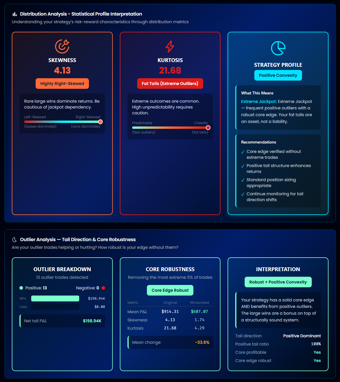
The statistical shape of your trade returns. AlgoChef classifies your strategy into one of 16 distribution profiles based on:
- Skewness — Loss-heavy, Symmetric, Win-heavy, or Jackpot
- Kurtosis — Predictable, Normal, Volatile, or Extreme
Knowing your profile helps you pick the right Monte Carlo method and understand which risks your averages hide. Full detail in Distribution metrics.
Outlier Analysis
Shows how dependent your results are on a handful of exceptional trades. If removing the best few trades would erase most of the profit, the edge is fragile — see outlier dependency.
Suggested Targets
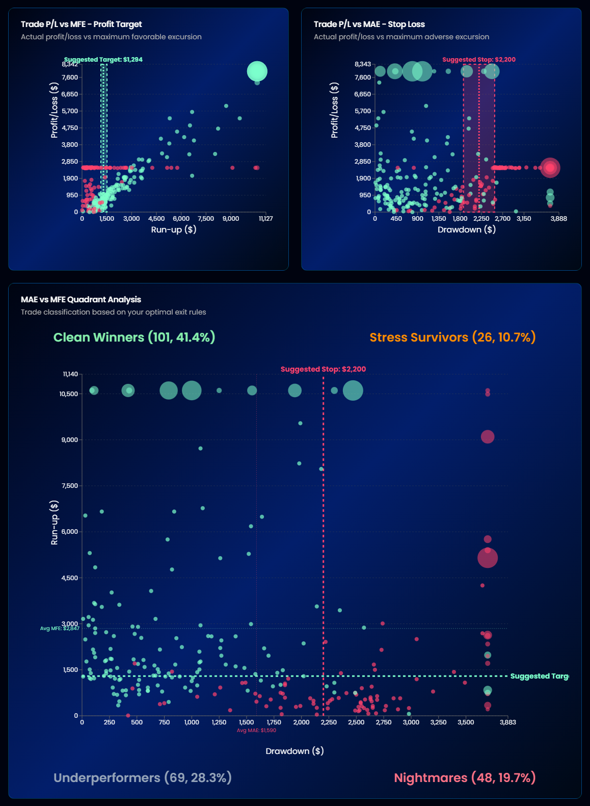
Data-driven profit target and stop loss suggestions derived from your trades' MAE/MFE behavior:
- Trade P/L vs MFE — Profit Target: plots each trade's final result against how far it went in your favor at its best moment. If many trades peak well above where they close, a fixed profit target could capture more of the move. The chart tests dozens of candidate target levels and highlights the one that would have maximized total profit.
- Trade P/L vs MAE — Stop Loss: plots results against how far trades went against you. If winners rarely dip beyond a certain adverse level, a stop there would cut losers without clipping winners.
A scale selector (0.5σ to Max) zooms the charts to the trade population you care about. Suggestions need enough trades (roughly 50+) to be meaningful.
Warning
Suggested targets are historical observations, not guarantees. Always re-test a modified strategy — changing exits changes the whole distribution.
MAE/MFE Quadrant
Every trade plotted by its Maximum Adverse Excursion (worst drawdown during the trade) and Maximum Favorable Excursion (best unrealized profit). The quadrants reveal exit quality: winners that endured deep adverse moves, losers that were once profitable, and so on. Requires imports that include intra-trade price data.
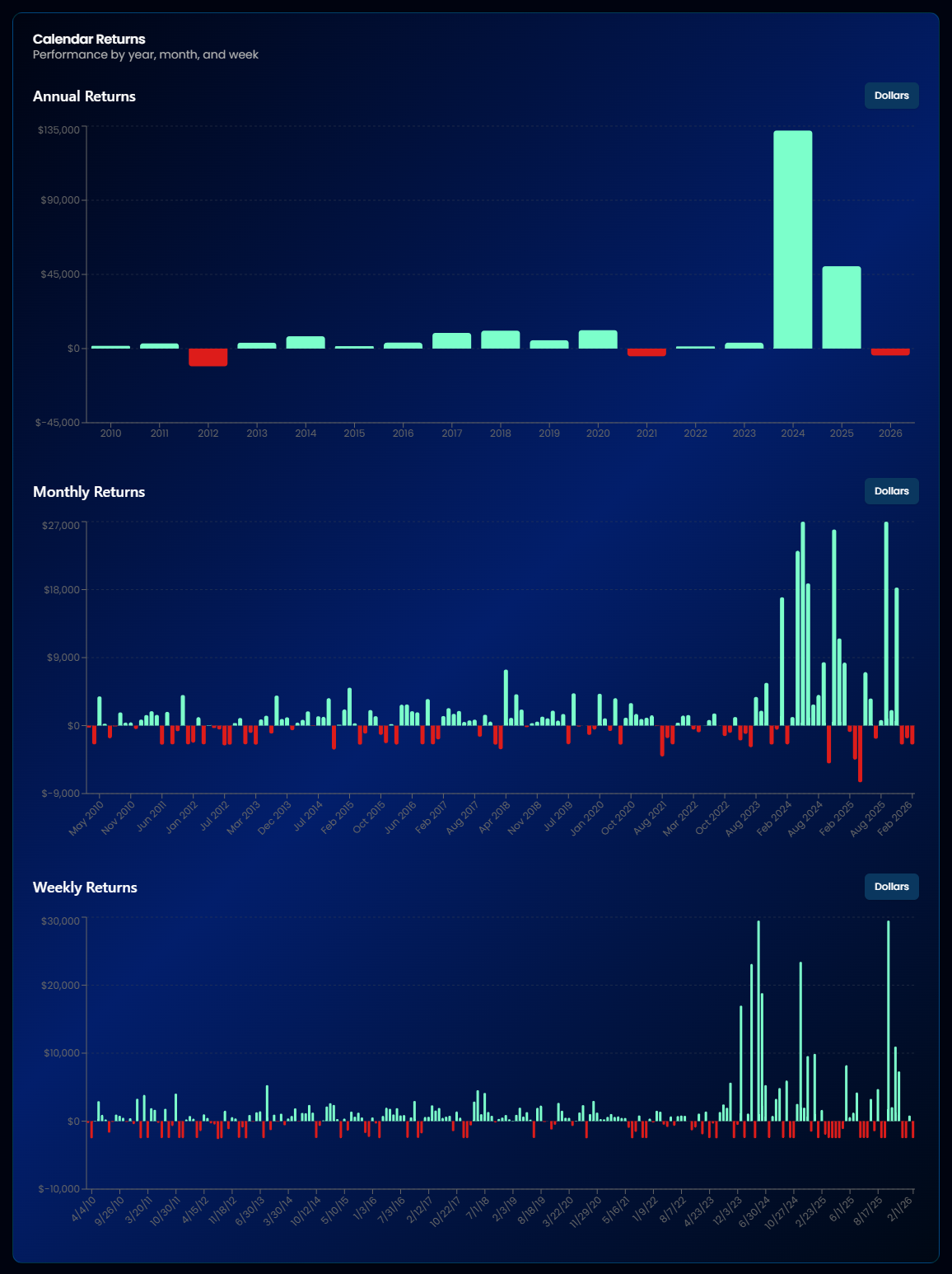
Calendar Returns
Calendar Returns & Period Performance
A month-by-year heatmap plus period summaries. Spot seasonal patterns, weak months, and year-over-year consistency at a glance.
Monthly Analysis
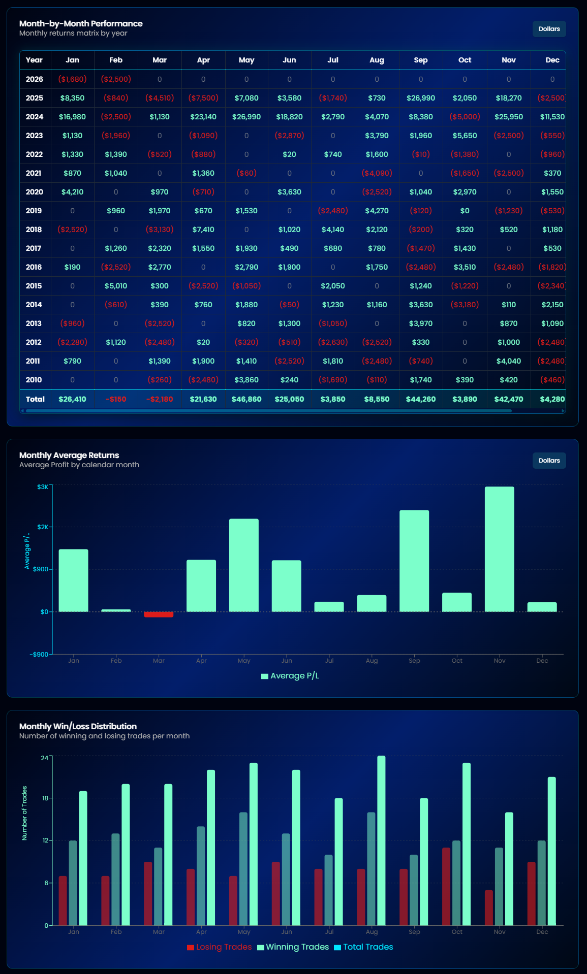
Four views of the same question — "how does this strategy behave month to month?"
- Month-by-Month Matrix — every month's return in a grid
- Monthly Average Returns — the average return for each calendar month (all Januaries, all Februaries, …), exposing seasonality
- Monthly Win/Loss — how often each month closes positive
- Monthly Analysis Table — the numbers behind the charts
Daily & Session Analysis
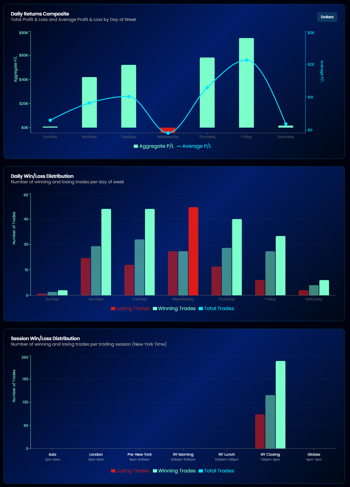
- Daily Returns Composite / Daily Win/Loss — P&L broken down by day of week. Are Mondays consistently better than Fridays?
- Session Win/Loss / Session Returns — performance by market session (time of day). Useful for intraday strategies to see whether the edge is concentrated in specific hours.
Trade Distributions
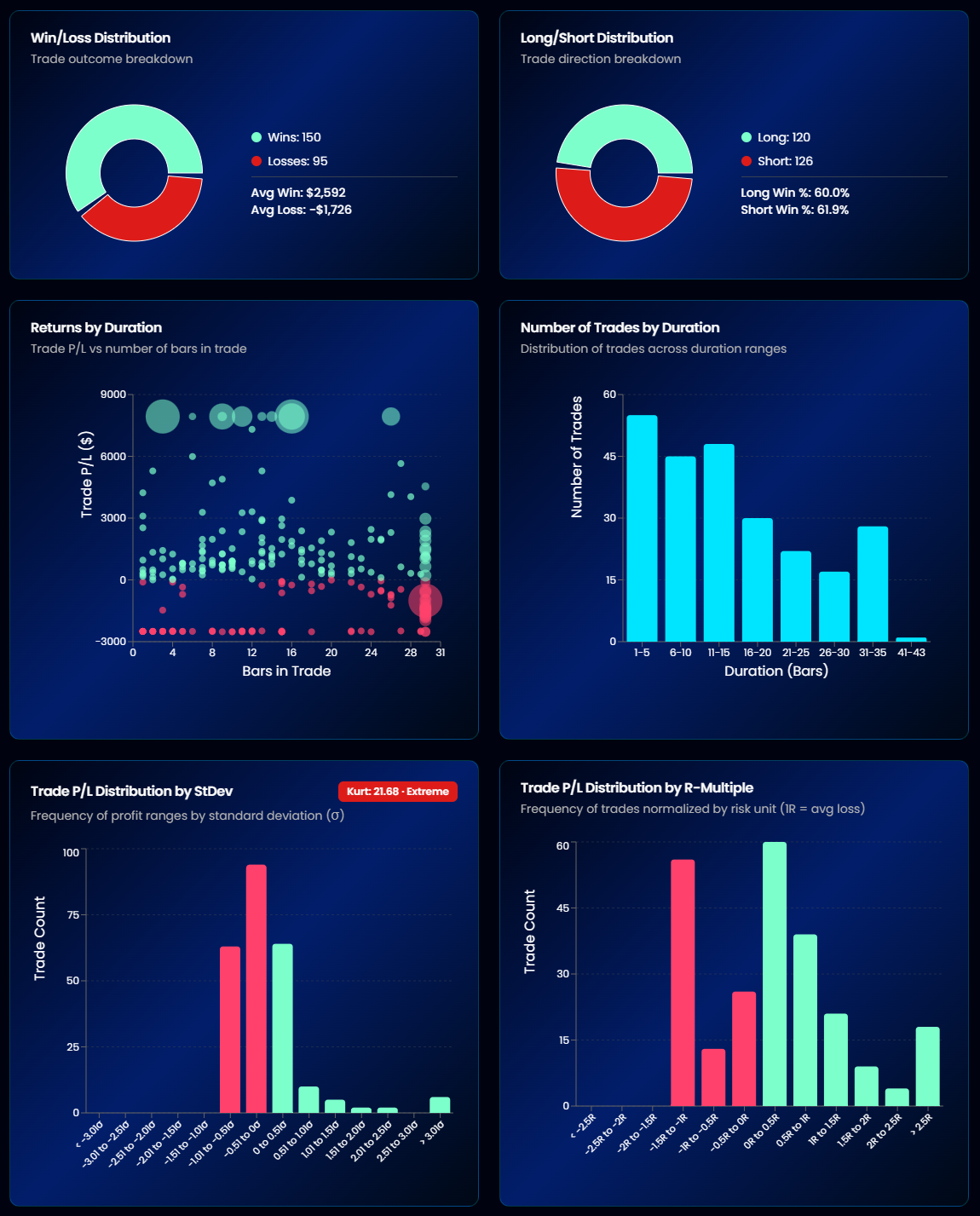
- Win/Direction Distribution — wins vs losses split by long and short trades
- Returns by Duration — do quick trades or long holds make the money?
- Trade P/L Distribution — histogram of all trade outcomes; see whether returns come from many small wins or a few large ones
Data Tables
- Annual Breakdown — every year's key stats side by side
- Monthly Breakdown — the same at monthly resolution
- Trade Records — a scrollable table of every individual trade: dates, prices, P&L, duration, and side
What's Next After Analysis?
Once you understand your strategy's performance:
- Monte Carlo Simulation — Stress-test across 5 resampling methods
- Strategy vs Benchmark — Find out if your alpha is real or just market exposure
- Crisis Dependency — Check if your edge depends on market panics
- Head-to-Head — Compare up to 8 strategies side by side
- Portfolios Hub — Combine your best strategies into diversified portfolios
- Health Monitor — Track strategy degradation over time
Tip
Ready to see this in action? Start your 14-day free trial.