Health Monitor
The Health Monitor provides ongoing surveillance of a strategy's health. While the Health Score on the Quality Report gives a snapshot, the Health Monitor shows you where and how a strategy is drifting from its historical self. For context on why health monitoring matters, see Why Strategies Fail — Regime Dependency.
Where to find it: In the app sidebar, open Health Monitor, then pick a strategy with the strategy picker at the top (or jump straight in from the Strategy Hub via View HM). The page analyzes one strategy at a time.
Page Layout & Options
The page is organized into sections you can jump to from the sidebar: Health Status, Score History, Equity & Drawdown, Performance Tables, Decay Diagnosis, Rolling Sharpe, Win Rate Divergence, Trade P/L vs StDev, and Edge Drift (CUSUM).
Two controls apply throughout:
- Position filter — analyze the Full Strategy, Long Only, or Short Only. Useful when one side of a symmetric strategy is degrading while the other still works.
- Window view toggle — show charts for IS+OOS (baseline and recent periods together) or OOS Only (zoom into just the recent window).
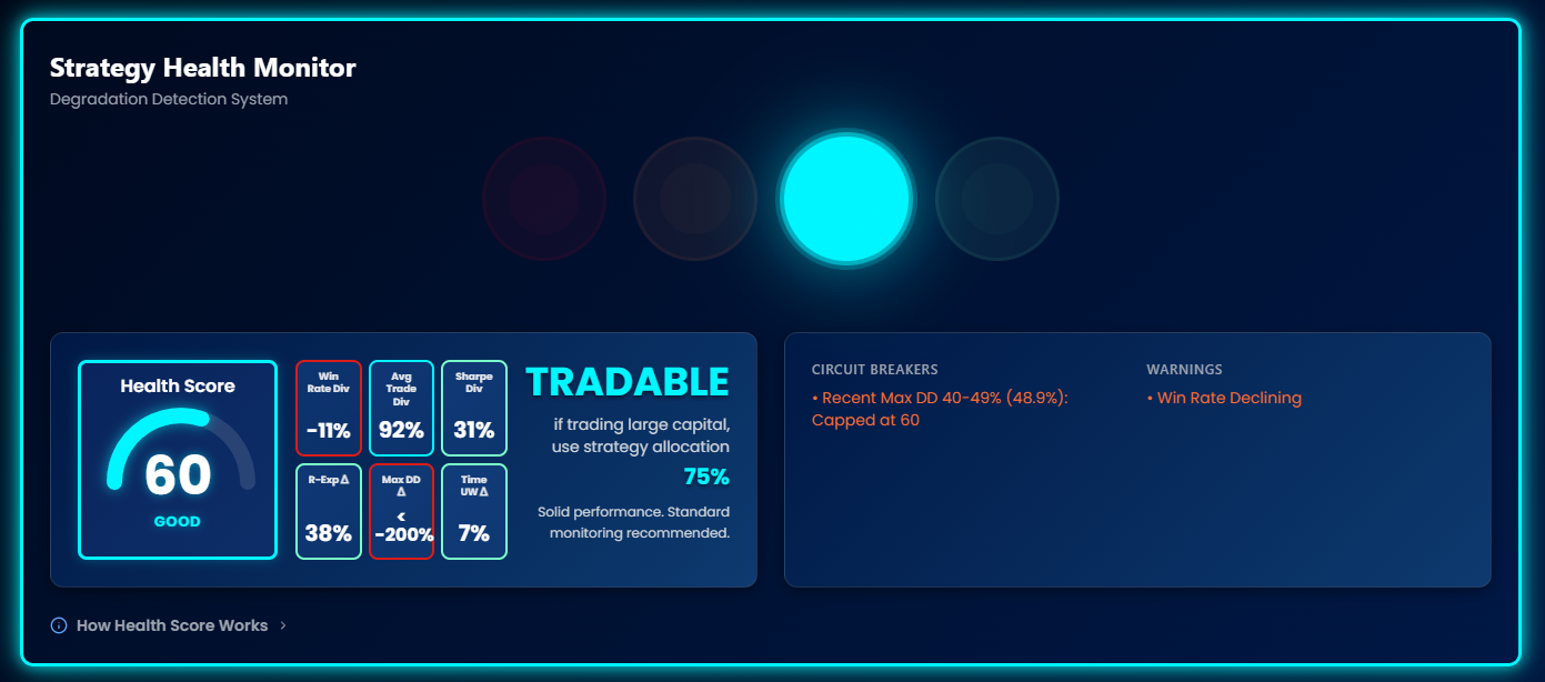
Traffic Light System
Each strategy gets a traffic light status based on its Health Score:
| Light | Label | Score | Meaning | Action |
|---|---|---|---|---|
| Green | EXCELLENT | 80+ | Performing as expected or better | Continue trading |
| Cyan | GOOD | 60–79 | Slight drift from baseline | Monitor regularly |
| Orange | CAUTION | 40–59 | Notable degradation | Reduce exposure, investigate |
| Red | CRITICAL | 30–39 | Significant degradation | Minimal exposure |
| Red | FAIL | < 30 | Severe degradation | Stop trading |
The light itself has four colours — CRITICAL and FAIL share the same red, so a score of 35 and a score of 12 both show red. The written label is what separates them. A strategy without enough trades to judge shows a grey Insufficient Data state instead of a colour.
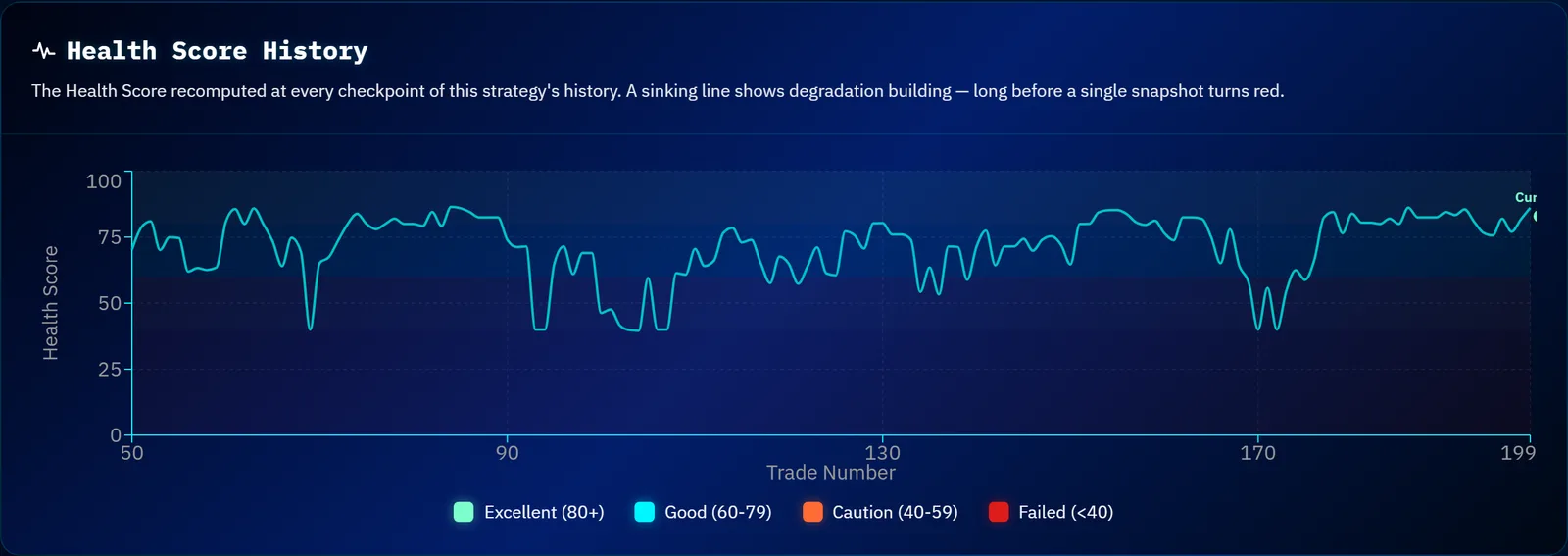
Score History
A running record of this strategy's Health Score over time, so you can tell the difference between a score that has always sat where it is and one that has fallen there recently. A single reading tells you the current state; the history tells you the direction, which is usually the more actionable of the two.
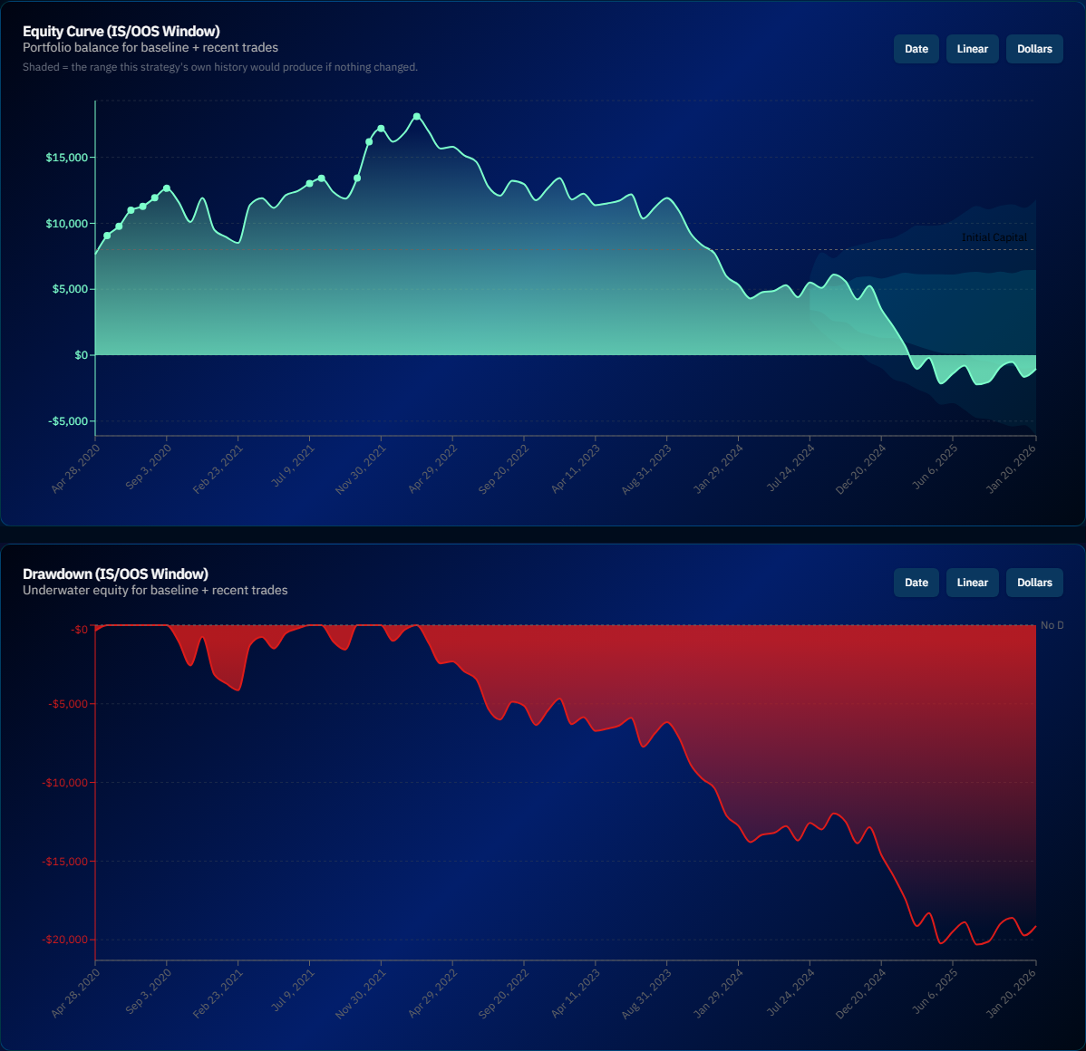
Equity & Drawdown (IS/OOS Window)
Two paired charts — Equity Curve (IS/OOS Window) and Drawdown (IS/OOS Window) — with the in-sample/out-of-sample boundary marked. This is the fastest visual check: does the recent equity slope look like the historical one, and are recent drawdowns deeper or longer than they used to be?
Performance Tables (Recent Performance Metrics)
The Health Monitor splits your trade history into In-Sample (historical baseline) and Out-of-Sample (recent performance) periods, then measures divergence across key metrics — grouped into core edge, risk/consistency, and profitability tables. For each strategy, it shows side-by-side IS vs. OOS metrics:
| Metric | IS (Baseline) | OOS (Recent) | Divergence |
|---|---|---|---|
| Win Rate | 62.4% | 58.1% | -6.9% |
| Avg Trade | $245 | $198 | -19.2% |
| Sharpe Ratio | 1.82 | 1.45 | -20.3% |
| R-Expectancy | 0.38R | 0.29R | -23.7% |
| Max DD % | 18.5% | 22.1% | +19.5% |
| Time Underwater | 32% | 41% | +28.1% |
Example data — negative divergence in returns metrics and positive divergence in risk metrics both indicate degradation.
Performance Trend Charts
Rolling Sharpe
Tracks the Sharpe Ratio over rolling windows to see if risk-adjusted returns are trending down. A gradual slide is a stronger degradation signal than a single bad month.
Win Rate Divergence
Compares the rolling win rate against the historical average. A persistent drop below baseline signals degradation; brief dips are normal variance.
Trade P/L vs StDev
Individual trade results plotted over time against their historical standard deviation bands. Trades landing outside the bands — especially clusters of unusually large losses — mean the strategy is behaving differently than it used to.
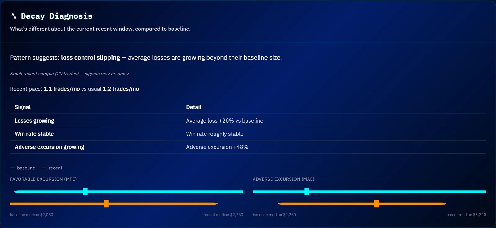
Decay Diagnosis
When the score indicates degradation, this section names the most likely pattern rather than leaving you to infer it from the charts. It distinguishes between:
- Entry signal degradation — you are winning noticeably less often than your baseline
- Trend exhaustion — you win as often as before, but the winners are getting smaller
- Loss control slipping — your average loss is growing beyond its baseline size
- Pace shift — the strategy's trading rhythm has changed
These point at different fixes. A strategy that has stopped catching moves needs different attention from one still catching them but giving more back.
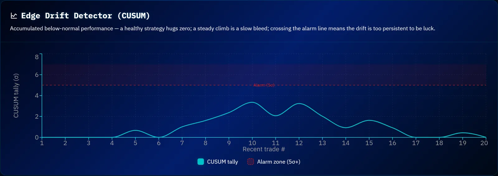
Edge Drift (CUSUM)
Window-versus-window comparison has a blind spot: a long run of slightly-below-baseline trades, none of them individually alarming, can dilute away when you average a whole period. This chart accumulates those small shortfalls so a slow bleed becomes visible before any single window looks bad. It is the section to check when the headline score still looks acceptable but something feels off.
Alert System
The Health Monitor generates alerts when:
- Health Score drops below a threshold
- A recent drawdown is materially worse than the strategy's own historical worst — this is relative, not a fixed percentage, so a strategy whose worst was ever shallow still trips it
- A sustained run of below-baseline trades accumulates, even though no single trade looks alarming
- A recent drawdown is severe in absolute terms, regardless of history
- Win rate collapses to less than half the historical rate
- Consecutive loss streak exceeds the historical maximum
Info
The Health Monitor is most useful for strategies you're actively trading. Import fresh trades periodically and check if the scores hold up. A strategy that looked great during backtesting may degrade when market conditions change.
Best Practices
- Review weekly — Check traffic lights for all active strategies
- Investigate orange — Don't wait for red; investigate caution signals early
- Compare IS/OOS — Look at which specific metrics are degrading
- Act on red — When a strategy hits red, reduce exposure or stop trading entirely. Use the IS/OOS comparison to understand which metrics degraded and whether the issue is temporary (a losing streak) or structural (a broken edge)
Tip
Ready to see this in action? Start your 14-day free trial.