Explore with Sample Strategies
Every new AlgoChef account comes preloaded with 10 sample strategies. They exist so you can learn the platform on realistic data before importing anything of your own. This lesson is a 15-minute tour using only the samples — no files, no setup.
Info
Samples are marked Sample · read-only in the Strategy Hub. You can analyze them everywhere in the app, but you can't edit or rename them. If you ever delete them, a Restore samples button brings them back.
Step 1: Open the Strategy Hub
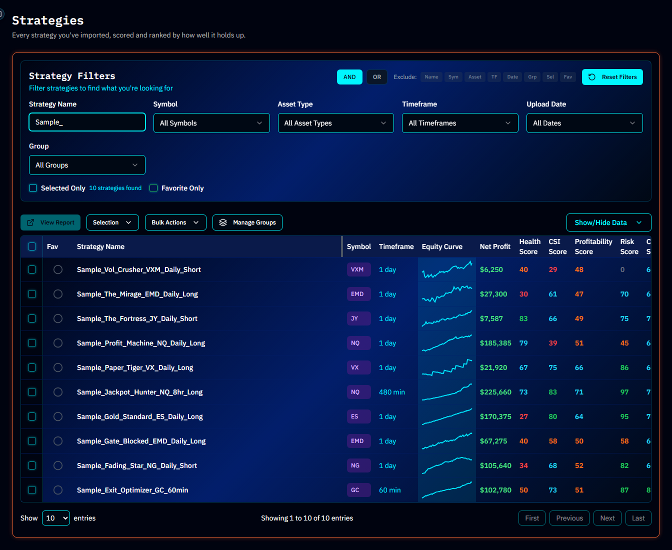
From the app sidebar, open Strategy Hub. This is your strategy library — every strategy you import will live here. Right now it holds the 10 samples, each with an equity curve sparkline, a CSI score with a color-coded tier badge, and quick actions.
Step 2: Notice the names
The samples aren't random — each one is a character you'll meet again in real trading. A few worth noticing:
| Sample | The character it plays |
|---|---|
Sample_Gold_Standard_ES_Daily_Long | The strategy everyone hopes they have |
Sample_The_Mirage_EMD_Daily_Long | Looks great at first glance — the numbers tell another story |
Sample_Jackpot_Hunter_NQ_8hr_Long | Profits concentrated in a few big wins |
Sample_Paper_Tiger_VX_Daily_Long | Impressive headline, fragile underneath |
Sample_Fading_Star_NG_Daily_Short | A once-good edge that's degrading |
Comparing how these score differently is the fastest way to develop intuition for what the platform measures.
Step 3: Open your first Quality Report
Double-click Sample_Gold_Standard_ES_Daily_Long (or choose View SA from its row menu). You're now looking at the Quality Report — the core analysis view in AlgoChef.
Don't try to absorb everything. For now, just notice the structure:
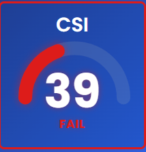
- Five scores at the top — Profitability, Risk, Confidence, CSI, and Health, each 0–100 with a colored tier badge
- Equity curve — account balance over time, with drawdown shading
- A long scroll of sections — drawdowns, rolling returns, calendar heatmaps, trade tables — with a section navigator in the sidebar
Step 4: Compare a good one against a bad one
Now open Sample_The_Mirage_EMD_Daily_Long the same way and put the two reports side by side in your head:
- How do the five scores differ?
- Does the equity curve look different in shape, not just direction?
- Scroll to Top Drawdowns — how deep and how long are the worst periods on each?
This is the entire AlgoChef habit in miniature: don't ask "did it make money?" — ask "what does the whole picture say?"
Tip
Want a structured comparison instead of eyeballing? Head-to-Head puts up to 8 strategies side by side. Try it with a few samples.
Step 5: Peek at the rest of the app
From the sidebar, glance at (don't study yet — later lessons cover each):
- Monte Carlo — stress-testing (Lesson 6)
- Health Monitor — degradation tracking (Lesson 7)
- Portfolios Hub — combining strategies (Lesson 8)
All of them work with the samples, so nothing is locked until you import.
What you learned
- Where strategies live (Strategy Hub) and how to open a Quality Report
- The five scores exist and are color-coded by tier
- Different strategies feel different in the report — and the samples are deliberately varied
Next lesson
The scores are the center of everything in AlgoChef, so let's learn to read them properly: What the Five Scores Mean →