Your First Health Check
Strategies don't usually fail with a bang — they fade. Win rates drift down, drawdowns stretch out, and by the time the equity curve makes it obvious, the damage is done. The Health Monitor exists to catch the fade early. This lesson is your first check, plus the five-minute routine to repeat weekly.
Info
For learning, open Sample_Fading_Star_NG_Daily_Short — a sample built around exactly this story — and compare it against Sample_Gold_Standard_ES_Daily_Long.
The one idea behind everything here
The Health Monitor splits a strategy's history into two windows:
- In-Sample (IS) — an earlier baseline period. This is the strategy's baseline self: how it behaved when it earned your trust.
- Out-of-Sample (OOS) — the recent period. This is the strategy now.
Every chart and table on the page asks one question: does "now" still look like "baseline"? Divergence is degradation.
Step 1: Open the Health Monitor
From the app sidebar, open Health Monitor and pick a strategy with the picker at the top. (Or jump straight in from the Strategy Hub via View HM on any row.)

Step 2: Read the traffic light
The Health Score maps to a traffic light — this is your headline:
| Light | Score | What it means | What to do |
|---|---|---|---|
| Green | 80+ | Behaving like its baseline, or better | Trade on |
| Cyan | 60–79 | Slight drift | Normal — keep watching |
| Orange | 40–59 | Notable degradation | Reduce exposure, investigate |
| Red | 30–39 | Significant degradation | Minimal exposure |
| Dark Red | < 30 | Severe degradation | Stop trading it |
Tip
The habit that matters: investigate orange. Waiting for red means waiting for losses to confirm what the data already suggested.
Step 3: Look at Equity & Drawdown with the IS/OOS boundary
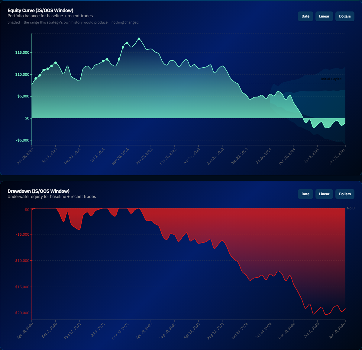
The Equity & Drawdown charts mark where the in-sample window ends and out-of-sample begins. This is the fastest visual check in the app: does the recent slope look like the historical slope? Are recent drawdowns deeper or longer than the baseline ones?
Step 4: Find which metrics are drifting
Scroll to Recent Performance Metrics — side-by-side IS vs. OOS tables grouped into Core Edge, Risk & Consistency, and Profitability. Each row shows baseline, recent, and the divergence between them. This is where a vague "it feels off" becomes specific: win rate is fine but average trade collapsed points to a very different problem than win rate cratered.
Then the Performance Trend Charts show the drift over time:
- Rolling Sharpe — a gradual slide is a stronger signal than one bad month
- Win Rate Divergence — recent win rate vs. the historical average; brief dips are noise, persistent gaps are not
- Trade P/L vs StDev — individual trades against historical volatility bands; clusters of outside-the-band losses mean the strategy is behaving differently than it used to
Two controls apply everywhere: a position filter (Full Strategy / Long Only / Short Only — one side of a symmetric strategy can die while the other lives) and a window toggle (IS+OOS together, or OOS zoomed).
Step 5: Adopt the weekly routine
For every strategy you actively trade:
- Glance at the traffic lights — 30 seconds
- Anything orange or worse → open it, read the IS/OOS tables, identify which metric is drifting
- Decide: temporary variance (a normal losing streak) or structural change (a broken edge)? The trend charts are the tiebreaker — variance is noisy, decay is directional
- Act on red: cut size or stop. The Health Monitor can't make this call for you, but it makes sure you're making it with evidence
Info
The Health Monitor is only as fresh as your data. If you're trading a strategy live, import its new trades periodically — a health check on stale data is a health check of the past.
Next lesson
You can validate one strategy end to end. Time to combine several: Your First Portfolio →